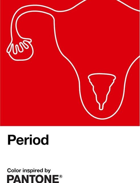
Pantone has created a new colour: Period Red
Pantone, the internationally reknowned colour system, has released a new hue: Period Red!
How lovely – with this, Pantone hopes to reduce the shame and taboo associated with women’s periods. Manchester United fans are hugely excited that their club colour has finally been given the correct name!

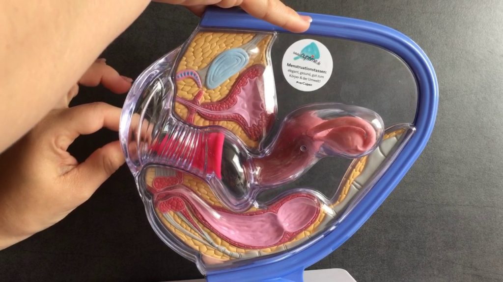
I’m just wondering why the launch of the campaign did not result in an anatomically correct diagram? The colour swatch depicts a menstrual cup inside a hugely out-of-proportion uterus. But the menstrual cup is NEVER inserted into the uterus! Only into the vagina! And seemingly, the right size ratio also doesn’t matter if you are busy getting rid of stigmas and taboos. However, on searching the internet I found only one realistic representation of an inserted menstrual cup. Clearly, this doesn’t make it easy for the staff at Pantone to reference an accurate representation of the period. This oversight makes it all the more obvious: it really is time to talk about and depict menstruation openly and without shame!
